
Understanding the Cost and Revenue Diagram
Understanding the Cost and Revenue Diagram
The concept of a cost and revenue diagram is one of the most important topics in economics because it helps explain how businesses make decisions regarding production, pricing, and profit. These diagrams are widely used in schools, colleges, and universities to show the relationship between costs, revenues, and output levels. By understanding these economic models, students and business professionals can better analyze how firms operate in different market structures.
A cost and revenue diagram usually includes curves such as total cost, average cost, marginal cost, total revenue, average revenue, and marginal revenue. These curves help economists determine whether a business is making a profit, breaking even, or experiencing losses. The diagrams also explain how firms choose the most efficient output level to maximize profits.
In modern economics education, these diagrams are essential because they simplify complex business concepts into visual representations. Students studying microeconomics often encounter these models when learning about perfect competition, monopoly markets, and business efficiency.
Cost and Revenue Diagram A Level Economics
The topic of cost and revenue diagram a level economics is especially important for students preparing for advanced economics examinations. At the A Level stage, students are expected to understand how businesses calculate profits and losses using graphical analysis.
A standard diagram typically includes several curves that represent different economic concepts. The average cost curve shows the cost per unit of production, while the marginal cost curve represents the additional cost of producing one more unit. Revenue curves demonstrate how much income the business earns from selling products.
Students often learn that profit maximization occurs where marginal cost equals marginal revenue. This point is considered the most efficient output level because producing beyond this point can reduce profitability. Understanding this principle is essential for answering exam questions and analyzing business behavior.
Teachers frequently use real-world examples to help students understand how firms apply these concepts. For example, manufacturing companies must constantly compare production costs with expected revenues to maintain profitability. Businesses that fail to manage costs effectively may struggle to survive in competitive markets.
A Level economics students also study how these diagrams change depending on market conditions. Perfect competition and monopoly markets have different revenue curves, making it important to understand the unique characteristics of each structure.
Cost and Revenue Diagram Economics
The study of cost and revenue diagram economics helps explain how businesses allocate resources and make strategic decisions. Economists use these diagrams to analyze efficiency, profitability, and market behavior across different industries.
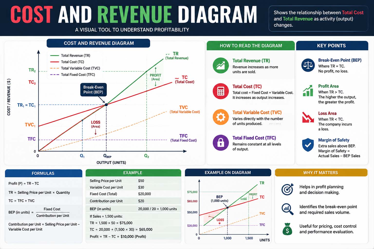
Costs are generally divided into fixed costs and variable costs. Fixed costs remain constant regardless of production levels, while variable costs change depending on output. Total cost combines both fixed and variable costs, giving businesses a complete picture of their expenses.
Total revenue increases as more units are sold, although the rate of increase may vary depending on market demand and pricing strategies.
These diagrams are particularly useful because they provide a visual method for understanding business operations. Instead of relying only on mathematical calculations, economists can observe patterns and relationships between different curves.
In economics, businesses aim to maximize profits by finding the ideal balance between costs and revenues. If production costs become too high relative to revenue, profits decline. On the other hand, if firms manage costs efficiently while maintaining strong sales, profitability improves significantly.
Cost and Revenue Diagram Economics A Level
Students studying cost and revenue diagram economics a level are expected to develop strong analytical skills and understand the theoretical foundations behind business decision-making. This topic forms a core part of microeconomics because it explains how firms behave under different market conditions.
One important concept taught at this level is economies of scale. As firms increase production, average costs may initially decrease due to greater efficiency. However, beyond a certain point, diseconomies of scale can occur, causing average costs to rise again. This creates the characteristic U-shaped average cost curve seen in many diagrams.
Another key concept involves the relationship between marginal cost and average cost. When marginal cost is below average cost, the average cost curve falls. When marginal cost rises above average cost, the average cost curve begins to increase. Understanding this relationship helps students interpret diagrams accurately during examinations.
Revenue analysis is equally important in A Level economics. In perfectly competitive markets, firms are price takers, meaning average revenue and marginal revenue remain constant. In monopoly markets, however, marginal revenue declines faster than average revenue because monopolists must lower prices to sell additional units.
Monopoly Cost and Revenue Diagram
A monopoly cost and revenue diagram differs significantly from diagrams used in perfectly competitive markets. In a monopoly, a single firm dominates the market, giving it significant control over prices and output levels.
The monopolist faces a downward-sloping demand curve because consumers buy more products only when prices decrease. As a result, the average revenue curve slopes downward, and the marginal revenue curve falls even faster below it.
Profit maximization for a monopoly still occurs where marginal cost equals marginal revenue. However, monopolists often produce lower output levels and charge higher prices compared to competitive firms. This allows them to earn abnormal profits in the long run.
Monopoly diagrams are important because they demonstrate how market power affects consumers and economic efficiency. Economists often criticize monopolies for reducing consumer choice and charging excessively high prices. However, supporters argue that monopolies can achieve large-scale efficiencies and invest heavily in innovation.
Importance of Cost and Revenue Analysis
The study of the cost and revenue diagram remains essential in economics because it explains how businesses make rational decisions in competitive markets. These diagrams help students, economists, and business owners understand the balance between production costs and income generation.


