
Tag: monopoly cost and revenue diagram
A monopoly cost and revenue diagram illustrates how a single firm determines output and pricing in a market without competition. The diagram typically includes the demand curve, which is also the average revenue curve, and a downward-sloping marginal revenue (MR) curve that lies below it due to price discrimination across units sold. The cost side includes the marginal cost (MC) curve and often the average total cost (ATC) curve.
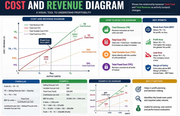
Understanding the Cost and Revenue Diagram
The concept of a cost and revenue diagram is one of the most important topics in economics because it helps explain how businesses make decisions regarding production, pricing, and profit.
Read More